The Homepage Mistake That Confuses Visitors
Someone lands on your website. You have a few seconds to make a good first impression.
Now imagine they see a giant block of text, five different offers, vague headlines, and too many buttons. They stop. They scroll a little. Then they leave.
This happens more often than business owners think.
The biggest homepage mistake is trying to say too much at once.
While many business owners focus on strategies used to improve local visibility, they often miss a bigger issue. A confusing homepage can push visitors away before they even learn what the business offers.
The takeaway is simple. A homepage should guide visitors, not overwhelm them.
Why Homepage Confusion Hurts Businesses
Visitors make quick choices.
Studies on user behavior show people often scan pages instead of reading every word. If the page feels crowded or unclear, they move on.
Confused visitors often:
- Leave the website quickly
- Visit fewer pages
- Skip forms
- Ignore call buttons
- Forget the business
People do not want to work hard to understand a website.
They want answers fast.
The Biggest Homepage Mistake
The mistake is trying to tell visitors everything at once.
Business owners often think:
“We offer many services. Let’s put all of them on the homepage.”
That sounds helpful.
But it usually creates clutter.
A homepage should not act like a giant storage room. It should act like a guide.
Think of walking into a store.
If products are thrown everywhere with no signs, customers feel lost.
Websites work the same way.
Signs Your Homepage Is Confusing Visitors
Some warning signs are easy to spot.
Too Many Calls To Action
Buttons are important.
Too many create problems.
Examples:
- Call now
- Request quote
- Read blog
- View services
- Learn more
- Watch video
- Contact us
- Get started
Visitors suddenly have too many choices.
Choice overload can stop people from taking action.
Stick with one main goal.
Headlines That Say Nothing
Some homepages use words like:
“Trusted Solutions”
“Professional Excellence”
“Your Success Partner”
These phrases sound nice.
But they do not explain anything.
People should understand your business within seconds.
Clear beats clever.
Good examples:
- Civil Engineering Support For New Developments
- Masonry Services For Homes And Commercial Buildings
Simple works.
Long Walls Of Text
Large paragraphs scare readers.
People scan first.
Use:
- Short paragraphs
- Lists
- Clear headings
- Simple sections
Make pages easy to move through.
Too Many Services Shown Equally
Not every service needs the same attention.
Businesses often place ten services on the homepage with equal size and space.
Visitors cannot tell where to start.
Instead, highlight:
- Main services
- Most requested work
- High value services
Leave details for service pages.
What Visitors Actually Want
People often arrive with a specific goal in mind. Someone searching for home exterior improvement ideas may not want a long company story. They want quick answers and a clear path forward.
Most visitors arrive with one question:
“Can this business help me?”
That is it.
They want answers quickly.
Visitors Look For Three Things
What You Do
State it clearly.
No guessing.
Who You Help
Tell visitors who your service is for.
Examples:
- Homeowners
- Developers
- Commercial property owners
- Contractors
What To Do Next
Guide them.
Examples:
- Request a quote
- Schedule a consultation
- Call now
Simple directions remove confusion.
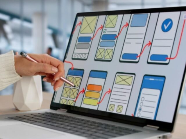
A Better Homepage Structure
Good homepages guide visitors step by step.
Here is a simple layout.
Hero Section
Start with:
Clear headline
Short explanation
One button
Request a Quote
Service Highlights
Show a few key services.
Keep descriptions short.
Trust Signals
Add:
- Reviews
- Certifications
- Years of experience
- Real project photos
- Client logos
Trust helps visitors feel comfortable.
Recent Work
Show examples.
People like proof.
Real work builds confidence.
Simple Contact Section
Make contacting you easy.
Do not hide forms.
Do not ask for too much information.
Common Homepage Problems Businesses Miss
Small issues create big problems.
Watch for these:
Auto-Playing Videos
Many people close pages with loud videos.
Popups Everywhere
One popup may help.
Five become annoying.
Slow Loading Images
Large files slow websites.
Slow pages create frustration.
Hard To Read Text
Tiny fonts and poor spacing hurt readability.
Simple design often wins.
Small Changes Can Create Big Results
You do not need a complete redesign.
Sometimes small fixes help:
- Remove extra buttons
- Rewrite headlines
- Shorten text
- Highlight key services
- Add real photos
- Make contact options easier
Small improvements reduce confusion.
Less noise often creates better results.
Frequently Asked Questions
How long should a homepage be?
Long enough to answer questions. Short enough to avoid confusion.
How many buttons should a homepage have?
Focus on one main action. Add supporting actions only if needed.
Should every service appear on the homepage?
No. Highlight key services and place details on service pages.
Why do visitors leave websites quickly?
Many leave because pages feel confusing or overwhelming.
What is the most important part of a homepage?
The top section matters most because visitors decide quickly if they want to stay.
